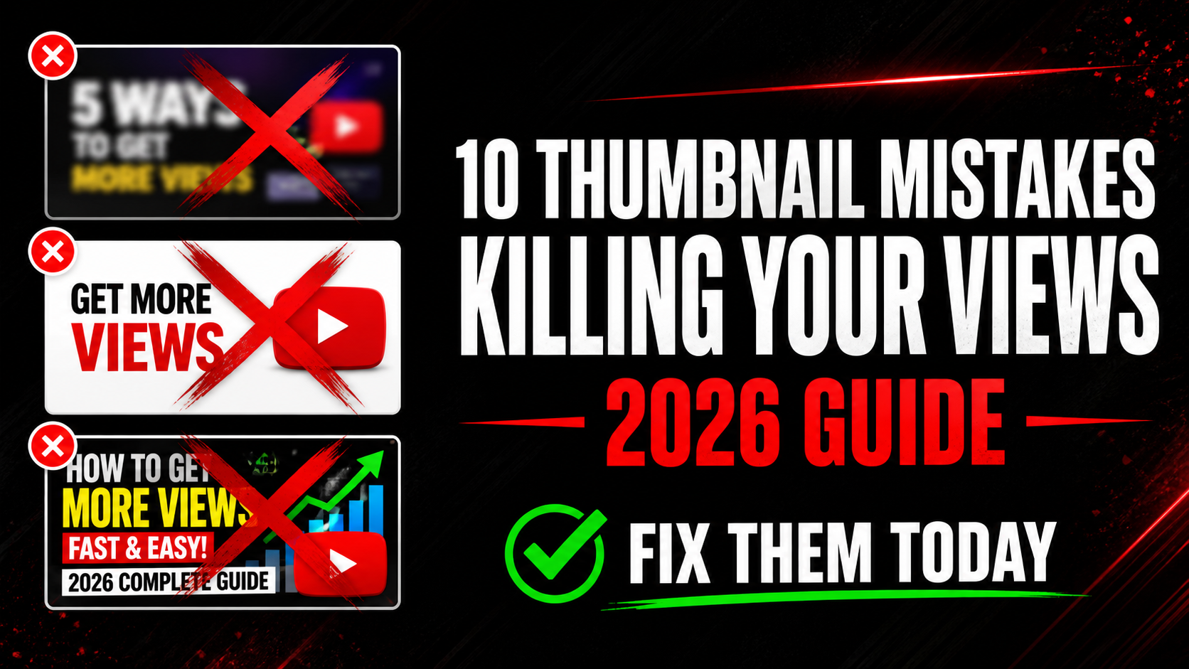
10 YouTube Thumbnail Mistakes That Kill Your Views in 2026
Your video could be the best on YouTube — but if your thumbnail is wrong, nobody will ever click to watch it. The brutal truth is that most creators lose 80% of their potential views because of avoidable thumbnail mistakes. In this guide we break down the 10 most common thumbnail mistakes in 2026, why they destroy your click-through rate, and exactly how to fix each one today.
Your thumbnail does one job — get the click. If it fails at that job, nothing else matters. Let us go through each mistake and fix it right now.
YouTube's interface is white. When you use a white or pale background on your thumbnail it disappears into the page. Your thumbnail becomes invisible against the feed. Viewers literally cannot see it. This is one of the biggest CTR killers and it is completely avoidable.
Think about it — when you scroll YouTube search results, the thumbnails that catch your eye are always the ones with dark, bold, or bright backgrounds. White thumbnails get ignored every single time.
More than 70% of YouTube traffic comes from mobile phones in 2026. On a mobile screen your thumbnail is roughly the size of a playing card. If you have a paragraph of text on your thumbnail nobody can read it — and when viewers cannot read it they skip it.
Many creators make the mistake of repeating the entire video title on the thumbnail. This is wrong. The thumbnail text should ADD something the title does not say — not copy it.
This is the mistake that surprises most creators. You design your thumbnail at 100% zoom on a large monitor. It looks great. You upload it. Then on a mobile phone it looks completely different — text is unreadable, faces are tiny, colors look washed out.
YouTube shows thumbnails at many different sizes across different placements. The mobile search result thumbnail is tiny. The sidebar thumbnail is small. The homepage recommendation is medium. Most creators never check any of these before going live.
👁️ See How Your Thumbnail Really Looks Before Upload
Preview your thumbnail in mobile search, desktop, sidebar, and Shorts feed for free. Catch mistakes before your video goes live.
Preview My Thumbnail Free →When you upload a video YouTube automatically selects 3 frames from your video as thumbnail options. These auto-generated thumbnails are almost always terrible — random mid-sentence facial expressions, blurry frames, or boring moments that do not represent your video at all.
Creators who use auto-generated thumbnails average 60-70% fewer clicks than creators who design custom thumbnails. It is the single highest-impact change you can make to your channel right now if you are still using auto thumbnails.
The human brain processes faces faster than any other visual element. Faces with strong emotions — shock, joy, fear, excitement, anger — trigger an immediate emotional response in viewers. This response makes them want to click to find out what caused that reaction.
Thumbnails with human faces showing strong emotion consistently outperform faceless thumbnails by 30-40% on average CTR. If your thumbnail has a face but the expression is neutral or smiling gently it is also underperforming. Neutral = forgettable.
The correct YouTube thumbnail size is 1280×720 pixels. Uploading a smaller image makes YouTube stretch it — and stretching always causes blurriness. Uploading a file over 2MB makes YouTube compress it — and compression causes pixelation.
A blurry thumbnail instantly signals low quality to viewers. Even if your content is excellent, a blurry thumbnail tells viewers your video is not worth their time. First impressions are everything.
Your thumbnail and title are a team. Together they should tell a complete story that makes the viewer curious. When both say the exact same thing it is a wasted opportunity. Viewers feel they already know everything about the video so there is no reason to click.
For example — if your title says "I Tried the World's Hottest Pepper" and your thumbnail text also says "World's Hottest Pepper" you have given all the information away. Nothing left to discover. No reason to click.
The biggest channels on YouTube have instantly recognizable thumbnails. When you see a MrBeast thumbnail you know it before reading the name. That recognition is built by using consistent colors, fonts, and layouts across every video.
When your thumbnails all look different — different colors, different fonts, different styles — viewers who have seen your videos before cannot recognize your content in their feed. You lose repeat viewers who would otherwise click immediately.
A common mistake is looking at what works for top creators in your niche and making thumbnails that look similar. The logic seems right — if that style works for them it will work for me. But the result is that your thumbnail blends into the feed instead of standing out from it.
When 10 videos in a search result all have the same dark background with yellow text and a shocked face, your job is to be the one that looks completely different. The thumbnail that stands out from the pattern gets clicked.
Your first thumbnail is rarely your best thumbnail. Top creators test multiple versions and update thumbnails on their videos regularly — especially on videos that are still getting impressions but low clicks. YouTube itself recommends updating thumbnails to improve performance.
If you have videos with more than 500 impressions per month and less than 3% CTR you have a thumbnail problem that is costing you views every single day. Those are fixable views you are leaving on the table.
✅ Thumbnail Quality Checklist — Check Before Every Upload
How to Analyze Top Creator Thumbnails in Your Niche
The fastest way to improve your thumbnails is to study what already works. Here is the exact process top creators use:
Go to YouTube and search your main video topic. Look at the top 10 results. These videos are ranking because they have high CTR, high watch time, and relevant content. Their thumbnails have been tested and proven to work with real audiences.
Use the free YTThumbnailGrabs Downloader to download those thumbnails in Full HD. Study them side by side. Ask yourself:
- What background colors appear most often in the top results?
- What font style and size do they use for text?
- How many use faces? What expressions?
- What is the overall mood — exciting, educational, shocking, funny?
- Which thumbnail is the most different from the others?
Once you understand the pattern of your niche you have two options. Either design within the proven style but better than everyone else — or deliberately break the pattern to stand out. Both strategies work. The only wrong strategy is copying thumbnails without understanding why they work.
How to Check Your YouTube Thumbnail CTR
Your CTR (click-through rate) is the percentage of people who click your thumbnail when they see it. Here is how to find it:
- Go to YouTube Studio at studio.youtube.com
- Click Analytics in the left sidebar
- Click the Reach tab at the top
- Look for Click-through rate
Here is how to interpret your CTR:
- Above 10% — excellent, your thumbnails are working very well
- 5-10% — good, above YouTube average
- 3-5% — average, room for improvement
- Below 3% — your thumbnail needs redesigning urgently
- Below 1% — your thumbnail is actively hurting your channel
Check the CTR for individual videos too — not just your channel average. A video with 1,000 impressions and 1% CTR is getting 10 clicks. Fix that thumbnail and you could get 50-100 clicks from the same impressions. That is 5-10x more views from a design change that takes 30 minutes.
⬇️ Download Competitor Thumbnails for Free
Study what works in your niche. Download any YouTube video thumbnail in Full HD instantly — no login, no app, completely free.
Download Thumbnails Free →Frequently Asked Questions
📖 Related Guides
- 👁️ Preview Your Thumbnail Before Upload — Free Tool
- ⬇️ Download Any YouTube Thumbnail in HD — Free Tool
- 🎨 Best YouTube Thumbnail Background Colors That Get Clicks
- 🚀 How to Make YouTube Thumbnail Get More Clicks in 2026
- 🔍 Why is My YouTube Thumbnail Blurry? Fix Guide
- 🔧 How to Fix Blurry YouTube Thumbnail — 5 Steps
- 💡 YouTube Thumbnail Ideas for Beginners 2026