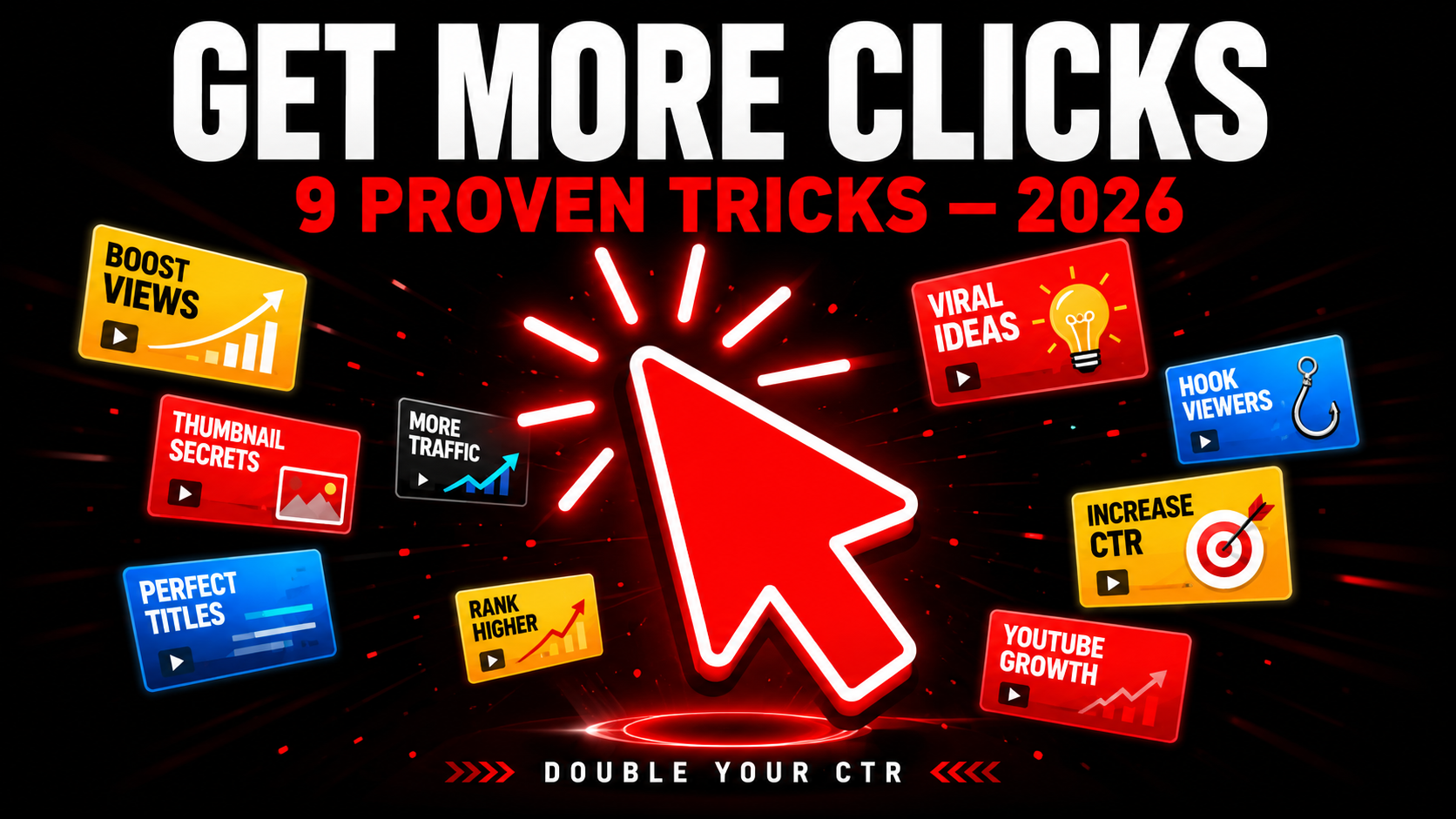
How to Get More Clicks on YouTube Thumbnails in 2026 — 9 Proven Tricks
More clicks from the same impressions means more views without doing anything extra. That is the power of a high-performing thumbnail. Every single person who sees your video in search results but does not click is a lost viewer you already had the chance to reach. This guide gives you 9 specific, proven tricks to turn more of those impressions into actual clicks — starting with your very next upload.
📊 Where Does Your CTR Stand?
Check your CTR in YouTube Studio → Analytics → Reach tab. If you are below 5% any of these 9 tricks will move you up. If you are below 2% apply all 9 starting today.
9 Proven Tricks to Get More Clicks
The fastest way to get more clicks from the same impressions is simple — look completely different from every other thumbnail in your search results. When viewers scan a page of results, their eye naturally stops at something that breaks the visual pattern.
Search your main keyword on YouTube right now and look at the top 10 thumbnails. What colors dominate? If everyone uses dark backgrounds, yours should be bright. If everyone uses red, try electric blue or yellow. The odd one out always gets noticed first.
A face in your thumbnail is good. A face with an extreme, unmistakable emotion is much better. The brain processes emotional faces faster than any other visual element, and stronger emotions trigger a stronger instinct to stop and look.
The key word here is extreme. A gentle smile does nothing in a competitive feed. Shock, pure disbelief, explosive joy, or genuine fear are the emotions that stop scrolls. When viewers see that level of emotion they immediately want to know what caused it — and that curiosity converts to a click.
This is the curiosity gap — the single most powerful click driver in YouTube history. When the thumbnail and title each tell a different half of the story, viewers are mentally forced to click to complete the picture. It works because incomplete information creates a psychological tension that the brain needs to resolve.
The thumbnail shows the outcome or the reaction. The title describes the setup or the method. Neither alone tells the full story. Together they create a question the viewer can only answer by clicking.
👁️ Preview Before You Upload — See Every Placement
Check how your thumbnail looks in mobile search, desktop, sidebar, and Shorts feed before uploading. Catch CTR-killing problems early.
Preview My Thumbnail Free →Text on a thumbnail has one job — add something the image alone does not communicate. If the text is too small to read at mobile thumbnail size it is not adding anything. It is just visual clutter that makes the thumbnail look busier and harder to process quickly.
The rule is simple: if a viewer cannot read your thumbnail text in under half a second while scrolling at mobile speed, that text is hurting your CTR not helping it. Either make it much bigger and bolder, or remove it entirely and let the image do the work.
Numbers in thumbnails — whether in text or implied visually — consistently outperform vague claims. A thumbnail that shows "47 DAYS" performs better than one that shows "WEEKS." A thumbnail showing "$2,347" outperforms one showing "MONEY." Specificity signals authenticity and makes the promise more believable.
This works because specific numbers feel like proof. Anyone can claim something vague. An exact number suggests the creator actually measured something real. Viewers instinctively trust specific claims more than general ones even before watching a single second of content.
Most creators design thumbnails at full size on a large monitor and upload without checking how they look at the actual sizes viewers see. A thumbnail that looks perfect at 100% zoom can have unreadable text, a clipped face, or a completely wrong crop in the mobile search view where most clicks actually happen.
YouTube shows your thumbnail in 4 different placements — mobile search, desktop search, sidebar, and Shorts feed — each at a different size and aspect ratio. Missing a problem in any one of these placements costs you real clicks every single day.
Every element you add to a thumbnail competes with every other element for the viewer's attention. Most thumbnails fail not because they lack creativity but because they have too many ideas fighting each other at the same time. Multiple faces, multiple text blocks, a busy background, and a graphic overlay all reduce the overall impact of every individual element.
The thumbnails that get the most clicks are almost always the simplest. One face. One emotion. One piece of text. One clear background. The viewer processes it in half a second, understands what the video is about, and either clicks or moves on. Simple thumbnails are processed faster and generate decisions faster.
The fastest shortcut to better thumbnails is studying what already works in your specific niche. Top-performing videos have high CTR thumbnails that have been proven with real audiences in real search results. Analyzing them reveals the visual language your specific audience responds to most.
This is not about copying — it is about understanding the proven patterns of your niche so you can either execute those patterns better or deliberately break them to stand out. You cannot do either without knowing what those patterns actually are.
Most creators think about thumbnails only at upload time and never again. But your older videos keep getting impressions in YouTube search and recommendations long after you publish them — and if those thumbnails are weak, every impression is a wasted click opportunity happening right now.
Go to YouTube Studio → Analytics → Reach for any video over 2 months old. If a video is getting more than 500 impressions per month with a CTR below 3% it is a prime candidate for a thumbnail update. A new thumbnail can immediately improve CTR on a video that has been quietly underperforming for months.
Best Colors for Getting More Clicks in 2026
Color is the first filter viewers apply when scanning a feed. Here are the colors that consistently generate the highest CTR across most niches:
Avoid white, light grey, and pale pastel backgrounds — they consistently underperform because they blend into YouTube's white interface and fail to stop the scroll.
⬇️ Download Competitor Thumbnails to Study What Works
Research the highest-performing thumbnails in your niche instantly. Download any YouTube thumbnail in Full HD — free, no login needed.
Frequently Asked Questions
📖 Related Guides
- 👁️ Preview Your Thumbnail Before Upload — Free Tool
- ⬇️ Download Any YouTube Thumbnail in HD — Free Tool
- 🚀 How to Make a YouTube Thumbnail Go Viral — 8 Element Formula
- ❌ 10 YouTube Thumbnail Mistakes That Kill Your Views
- 🎨 Best YouTube Thumbnail Background Colors 2026
- ⚔️ Thumbnail vs Title — Which Matters More?
- 🔍 Why is My YouTube Thumbnail Blurry? Fix Guide